Art Every Day, Thursday, May 16, 2013
Good Afternoon,
Here is today's new piece. I wanted to play with red and black and the really pretty batting you see underneath these fabrics. So, I ripped the base red fabric so that I had about 3/4" of batting showing on all sides then I ripped the dark gray strips and laid them down. I then laid down the piece of light red and folded the ends of the dark gray strips up over it then folded pleats into gray strips and pinned them down. Finally, I ripped some squares from a dyed black and started stitching.
I wont explain the stitching, you can see it for yourself, but I love how the layers look and how the stitching is effecting the depth. I also really like the dimensionality of the pleated up bits and I really, really like the color combo.
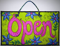
 I also spent quite some time in the past two days working on the open/closed signs for my gallery. They are pictured below. They were fun, but really ate up the time. They were quilted first on the bright yellow green using black thread then I painted them using Silks paints.
Till tomorrow,
Heather


2 comments:
I love how the batting really gets some background status in this piece, it's beautiful! It really draws the eye out and around, and nicely echoes the gray and black in the piece.
The red could have taken over the piece, but the heavier straight-edged quilting really sets it back and keeps it in the background. I love its frayed edges that look like they are seeping into the batting, they add some nice texture and interest. The frayed edges of the gray seeping into the red are even more textured and their color variations make for an interesting finish to their statement!
The echo of the wavy quilting in the batting and the gray fabric, along with the small stipple in the red tint gives the piece a nice flowy feel to offset the angles of the squares, the lines in the left edge, and the quilting in the dark red. This is contrast that's so fun and interesting to see.
Oh- and I forgot to say how much I love your Open and Closed signs!
If I remember correctly, that was a very popular color way in our color class- it's so universally appealing :)
Not to mention that you did a lovely job, they are very welcoming and pretty!
Post a Comment