Living This Creative Life

I have two favorite quotes. The first one is by Emile Zola, "If you asked me what I came into this world to do, I would tell you that I came to live out loud". I don't know who the second one is by, but it goes like this, "If you're not living on the edge then you might as well jump". Both of these sentiments sum up my personal philosophy of this experience we call life on earth. Enjoy!

Thursday, February 28, 2013

Art Every Day, Thursday, February 28, 2013

Good Morning,

Here is today's piece.  It has a lot more going on than yesterday's piece.  For this one, I began with a light blue green piece of dye painted batting.  It was topped with side bars of different widths in a pure hued red orange.  A piece of black was laid on top of the center then cool colored squares were added.  I pulled off several of the squares and set them aside and stitched down the remaining squares and black background with a grid in a blue green thread.  Then I added back the squares that I took away and stitched them down with a straight stitch around the perimeter. The orange bars were then stitched with a decorative feathers.  One of the things that I really like is the uneven lengths of the orange so that differing amounts of the batting shows.

I'm very pleased with the subtle difference in the depth between the stitched over squares and the squares that are simply top stitched.  I also really like the dichotomy of the very grid based center of the piece against the soft, decorative styling of the feathers in the orange.

Now, I shall go teach someone all about dyeing fabric,
Till tomorrow,
Heather

Wednesday, February 27, 2013

Art Every Day,  Wednesday, February 27th, 2013

Good Morning,

Ah Simplicity, I love you!  

This piece is very similar in color to yesterday's piece with it's strong warm-vs-cool colorway.  It began with the big, blue bone bead.  I wanted to be able to use at least one of them (I have three) so I chose the colors to coordinate with it.  

This piece is so simple, but it packs a wallop as far as machine quilting design, density and color choice are concerned. I was talking with a group of students this weekend about how to finish their highly decorative, embellished quilts and one of the gals was astonished by my belief that the more complex the quilt top is, the more simple the quilting should be and that simple meant not stitching on a ground with a contrasting thread color.  With this piece, I really wanted to show how even a little contrast, like the dark brown thread used for the stitching in the blue swath that runs through the break in the orange, can make a statement.  If you really want to add to a quilt top then contrasting thread can be used, however, tread carefully because every misstep with the machine will show. I kept the quilting really simple, yet bold, in the orange areas, matching thread color to fabric and choosing to use a straight(ish) line that moves in opposition to the vertical line in the brown stitching.  Then, in the blue background I used a stitch that contains a bit of both curve and straight line and quilted every 1/4"-1/8" to really push back that blue.  I purposely left lots of the dye painted orange batting around the outer edge to make a secondary frame.  I'm rather pleased with the whole effect.

Then, came time to decide where to put the circular/oval bead.  When you've only one accent to add, it's placement can be very important.  It's placement is exactly where it told me it needed to be.  It adds weight to the bottom of the piece and plays off of the broken curve in the orange really well.

Well, I'm trying like the dickens to get the info for my upcoming Taos retreat on line today - so off to work I go.

Till tomorrow,
Heather

Tuesday, February 26, 2013

Art Every Day, February 26, 2013

Good Afternoon,

I woke up in the middle of the night, last night, and couldn't sleep so I made this piece for today.  I managed to get back to sleep but then overslept and had to run out the door at eight this morning to make it to boot camp.  Managed to remember to bring the piece and my computer but forgot the camera.  So, now that I'm home I can finally get this baby up.

I began the piece with some fabulous Mexican Yute that I had dyed this lovey indigo color.  I laid it on top of some green dye painted batting then quilted it in a 1/2" grid.  Then I cut out circles of various sizes and hollowed them out and layered them so that they look like they are floating across the blue surface.

All of the circles are warm or warmish in color, so I quilted them in ways that would help create multidimensionality.  The circles that I wanted to sit the farthest back, I quilted with 5-6 rounds of stitch.  The circles that I wanted to sit closest to the viewer are stitched simply around the perimeter and the center and the circles that I wanted to sit in the mid plane have three rows of stitch.  I'm rather pleased with the depth.

Here's hoping for a better night sleep tonight!
Till tomorrow,
Heather

Monday, February 25, 2013

Art Every Day, Monday, February 25th, 2013

Good Afternoon,

Here is today's new piece. Steph recently commented on how she was beginning to prefer simpler design to the more complex.  I'm with her one hundred percent. Thanks so much to all of you who send me comments they are very meaningful for me. 

After yesterday's silken debauchery, this piece is much, much simpler. I began by layering a sheer white on top of black batting which I stitched down simply along the edges. Then I added the blue swoop and stitched around it and across it with gently waving lines. Finally, I added the three swirls in heavy black stitching.  I really love these swirls, they're so playful and bold. 

The white is occupying the negative space well, probably because so much of the black batting shows through therefore making the white more gray - except where it overlaps itself - and I like that look too.  The blue is sitting in the midground and the black swirls are in the fore ground.  I just love it when something this simple can be at once peaceful and energetic.

Till tomorrow,
Heather

Sunday, February 24, 2013

Art Every Day, Sunday, February 24, 2013

Good Afternoon,

I was so excited that I had the whole day today to work in my studio.  I got up and started working on my new piece of art that I started about two weeks ago, forgetting all about my daily work!  At two, I realized that I had not done one.

I spent all of yesterday teaching a large group of women all about embellishments, so I decided that I would base today's piece on them as well.  

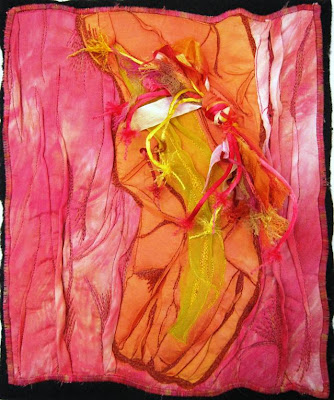
I began by gathering up some warm colored ribbons, cheesecloth and rattail. I cut them all about 10" long, bundled them and tied them in a knot.  Then I set the knot aside and selected three colors of fabric; a red violet silk dupioni, an orange dupioni and a bright yellow silk organza.  I crumpled them on to a piece of black batting and stitched the hell out of them forming long pleats and tucks as I stitched. 

Once all of the stitching was done I satin stitched the edge of the fabric where it met the batting then tacked on the tied bundle.

The piece is all about texture and dimensionality.  It's quite pretty too.

Till tomorrow,
Heather

Saturday, February 23, 2013

Art Every Day, Saturday, February 23rd, 2013

Good Morning,

Well, it was bound to happen, here's a little, layered landscape for today's piece.  I needed something quick and easy for this morning and I just wanted to play around with quilting depth along with value.  I like how the darker more heavily quilted areas recede both in the mountains and along the dark green horizon line.  Mostly, I like the bit of realism in the grasses in the close up foreground.

Now, I'm off to teach 21 ladies all about creating embellished quilts.

Till tomorrow,
Heather

Friday, February 22, 2013

Art Every Day, Friday, February 22nd, 2013

Good Afternoon,

Here is today's new piece.  My goal with it was to prove to myself, cause I need reinforcement, how much the quilting effects the quilt.  Here, I used very, very little quilting in an effort to see how the colors behaved.  Some of the rectangles are warm with cool colored circles and some are cool with warm colored circles.  In addition to visual temperature, I also played with value and am pleased with what has happened.  If you look at the yellow rectangle, it should be coming forward because it is warm and it does look like it is in front of the dark blue green circle.  However, the light blue circle looks like it's sitting on top of it, which it physically is.  However, look at the light blue circle in the orange rectangle.  It looks like it is underneath the orange fabric, as though the circle was cut from the orange to reveal the light blue below, only it's not, the blue is on top.  
Color is such a trip.  Sometimes visual temperature will trump all, other times color scale will take over. But, quilting will always trump both!
Hope you have a great day.
Till tomorrow,
Heather

Thursday, February 21, 2013

Art Every Day, February 21st, 2013,

Good Afternoon,

Here is today's new piece of work.  I had this moody, dark gray/black piece of fabric that was just begging to be night sky. So, I let it.  I used pure white for the moon and quilted it like Swiss cheese with circles of various sizes.  I then stitched the background with very energetic all over, small triangles.  Then, I selected a few fabrics from each of the twelve colors and cut short, narrow strips. I started with smaller pieces in the cooler colors in the upper left and made the pieces larger as the colors got warmer as they moved across the surface to the lower right.  I'm very pleased with both the sense of movement and dimension. 
To quote my student/friend, John, "My eyes are enjoying looking at it".
Till tomorrow,
Heather

Wednesday, February 20, 2013

Art Every Day, Wednesday, February 20th, 2013

Good Afternoon,

Here is my newest piece.  I think it's a lot of fun with the warm colored ovals swirling up and off the green "sticks". They are quilted very simply just inside the edge whereas the blue background is quilted very heavily, about every 1/8th". I love it when color behaves predictably with the cool blue sitting in the background, the green sticks in the midground and orange/yellow/red coming forward.  The toned violet, dye painted batting acts as a nice quiet frame and sits behind it's cool blue counterpart because it is duller.
Now, I'm off to dye some fibers and trims.
Till tomorrow,
Heather

Tuesday, February 19, 2013

Art Every Day, Tuesday, February 19th, 2013

Good Morning,

Here is today's new piece.  I wanted to play with melting crayons on fabrics and in so doing play with transparency when one color overlaps another color thus forming a blend or a third color.  What simple fun! I love the works of  both Kandinsky and Klee and wanted to do a simple color field with squares and rectangles running into and overflowing into each other. I decided on a simple but heavy grid for the quilting, using two black threads through the needle and leaving short, little tails to add just a bit of texture.  All in all, a fun little experiment and a great way to start the day.  Now, I'm off to boot camp and some hard exercise.  
Till tomorrow,
Heather

Monday, February 18, 2013

Art Every Day, Monday, February 18th, 2013

Good Morning,

One of the things that I try to teach my color & design students is how to really see what is in front of them.  Whether it is a tree or a piece of art that they are looking at, chances are they aren't really seeing all of it's nuances. It excites me when I see the evidence of "learning to see" in one of my students and that is what I get from all of the fabulous comments from Miss Christa.  Thank you girlie for your excited and active learning.  Witnessing it helps to make all that I do worthwhile.

Now, here is today's new piece.  I spent some more time yesterday refining the organization in my studio and getting it down to the basics.  While doing so, I found a bunch of hand painted fabrics that I had done several years ago when I fancied myself a fabric designer.  I figured now was a great time to use them.
  
This piece is quite simple and elegant.  The central leaf motif is quilted in the veins of the leaf and background stripes and the black frame that the leaf sits on is quilted with a curvy inner line.  It is the quilting in the negative space that was important to me.  The stamped leaves have such a great, scattering sense of movement and I wanted to keep that feel without relying on my old standard of outlining them and stitching a tiny stipple in between. And in walked the curvy crosshatch, all plain and simple as it is. It's gentle undulations gave the leaves all the movement they needed and let the negative space support the positive space beautifully.

I love it when I wake up in the morning and I'm an artist.

Till tomorrow,
Heather 

Sunday, February 17, 2013

Art Every Day, Sunday, February 17th, 2013

Good Afternoon,

I don't know about you, but I love days where you get to stay in your jammies all day long.  Today is one of those days for me.  I'm sure I should be out enjoying the great weather, but I'd rather quilt!

Here is today's new piece. I spent part of the last two days dyeing and rinsing silk cocoons and rods.  So I really had a hankering to play with one or both of them.  This piece began with dark red, dye painted batting, topped with strips of dyed yellow orange rayon ribbon.  The ribbon was topped with 5 strips of dyed silk carrier rods which was in turn topped with a bit of floral, stitched applique.  I made sure to orient the ribbon strips in one direction and the carrier rods in the opposite direction.

The carrier rods were quilted with long, vertical lines and you can see how ornately I quilted the background ribbons.  The little bit of silk carrier rods and bone beads at the bottom were added to better the  balance. 

I really enjoy the active background that the quilted ribbon provides.  It give the very simple focal point and counter point some powerful support which they needed.  Without the ornate negative space, the focal point would be too simple and not really enough to carry the piece. 

It was really fun to create a small quilted piece that has no "real" fabric in it.
Till tomorrow,
Heather

Saturday, February 16, 2013

Art Every Day, Saturday, February 16th, 2013

Good Morning,
Here is today's new piece.  It is very different from what I've been doing the past few days.  It began with the dark gray, dye painted Antimacassar (isn't that a weird thing to call a doily?). I really liked it against the red velvet.  I threw in some hand stamped black and white and added the pale yellow batting and bright yellow silk noil for some added zing (as if it needed it).  With the exception of the red circles on the yellow silk, I kept the quilting to a simple minimum and let the fabrics do the work for me.  After it was all stitched I realized that it was so heavy on the right hand side that I needed to add some red to the left hand side.  I ripped a strip of red cotton hand dye, twisted it and couched it on.  It sort of saved the day, but I'm still not sure that I like the piece.  It's a lot to take in, in such a small piece. It's got a real modern feel crossed with a little Native American influence.  It's boldness seems a bit brash - sort of like mine!
Till tomorrow,
Heather

Friday, February 15, 2013

Art Every Day, Friday, February 16, 2013

Good Afternoon,

Here is today's new piece of art.  Boy was it fun to do! I started with a base of deep black on red dye painted batting.  I quilted it with a straight stitch and a very fine satin stitch using a myriad of colors.  After the quilting I added the seven circles in varying sizes and colors.  Those were stitched down with a heavy black blanket stitch. 
 My goal today was to see how well the circles in the foreground could hold their own against such a busy background and if the background while so busy could still support the circles. I think it is pretty successful.   I'm glad that I used the two different widths of stitch in the background.  The straight stitch feels like it is laying behind the satin stitched lines which adds another sense of depth.  I love the sense of movement and how the circles seem to control the chaos on the background.
Till tomorrow,
Heather

Thursday, February 14, 2013

Art Every Day, Thursday, February 15, 2013

Good Afternoon,
I'm always amazed at how easily a day can get away from me.  I finished this piece at 7:30 this morning and here it is almost 2:00 in the afternoon and I'm finally getting it up.
With this piece, I wanted to continue on with a similar color way as yesterday's piece.  Only here, I'm using a much more modern sensibility. The colors are all sitting on a dark gray base of dye painted batting.  I repeated that dark gray with the three, short horizontal lines.  I used curvy quilting in both the red; wavy lines and the yellow; circles and kept the quilting in both the blue and green very architectural with straight lines moving into squares and rectangles. 
One of my students was talking to me this morning about color use proportion; how much of one color to use with how much of another.  There are lots of classic formulas, but mostly dealing with direct complements. Here, I used a proportionately larger amount of the cooler blue along with green and a smaller amount of warmer yellow along with red. Note how well the blue recedes and the yellow comes forward.  Also note how the red is trying to sit on the same plane as the green, but because it is physically on top of it, it's not succeeding as well as expected. 
I love that every day I get to wake up and be an artist!
Till tomorrow,
Heather

Wednesday, February 13, 2013

Art Every Day, Wednesday, February 13, 2013

Good Morning,
I so enjoyed yesterday's piece with it's girly, old fashioned feel that I decided to try that again today.  We used to put together packs of dye painted fabrics that we called "Fancy Fabrics", but no one really paid them much mind after we started dyeing so, I just brought the remaining few home with me to use in my every day art. 
I'm really into juxtaposition in art these days and that's what I really like about this piece; the vintage hankies with all of their lovely embroidery along side the bold red fabric that is topped with dark gray cheesecloth and stitched with a thoroughly modern looking grid.  The pink that is sitting in the opening of the blue accentuates the unusual color way and the dark gray, dye painted batting provides a nice frame for the whole thing.  I kept the quilting very simple in both the blue and green areas, just outlining the embroidery to show it off well. All in all, a great start to the day.
Till tomorrow,
Heather

Tuesday, February 12, 2013

Art Every Day, Tuesday, February 12, 2013

Good Morning,
Here is today's new piece.  It's much simpler than what I've been doing lately.  With it, I mostly wanted to see what happens when I put a bold color such as these reds in the negative space and put a weaker color, a color usually reserved for negative space such as this brown, into the positive space. 
I'm enjoying the color combination. It's got a quiet energy. The rectangle with the embroidered flowers works well as a focal point, aided as it is with the added dimension of the cheesecloth which surrounds it.  The ruffled fabric that makes the "L" formation works well as a counterpoint. The quilting in the negative space  is actively interesting but also heavy enough to keep the red behind the browns. All in all, it is a rather good experiment.
Till tomorrow,
Heather

Monday, February 11, 2013

Art Every Day, Monday, February 11, 2013

Good Morning,
Well, I said I was going to move on from the white/gray/neutral fix I was on.  So, here is today's new piece.  It's full of just about all of the colors.  I began by topping a piece of green batting with a deep blue violet hand dye.  That was topped with woven strips of yellow through red violet which was stitched down with a straight stitch.  I stitched the blue violet down with a tiny stipple and topped the whole thing with those fabulous three stitched swirls.  They were done with two threads through the needle, one blue green and the other green. 
I like the color in this piece a lot as well as the nice mix of straight and swirl.  The depth is really cool too, The blue green/blue violet sits nicely in the background with the warm woven section in the mid ground and the thin swirls in the front plane. It's wonderful to be able to get such depth in such a small piece utilizing the elements of color, line and shape and the principles of position, dominance and repetition. All in all, a great way to start the new week.
Now, I'm heading back to the studio to work on one of my new show pieces.
Till tomorrow,
Heather

Sunday, February 10, 2013

Art Every Day, Sunday, February 10, 2013

Good Morning,

Here is today's new piece. I guess I'm on a gray and white kick.  This piece began with a sheer layer of bright yellow cheese cloth laid out over black batting.  Then I added the dark gray and white sections.  I was surprised by how much the yellow showed through the white, but decided it was just a design element. I then added the squares of stamped black & white fabric and topped them with the red velvet squares (which I now wish I had made larger because the scale is off just a bit).  I quilted the gray with straight, vertical lines and the white with a maze like design, the tightness of which is making the yellow cheesecloth show through even more. 
I like the minimalistic look of the piece and the stark contrasts in color/value, quilting pattern and fabrics. I'm getting a little bored with all of the linear quilting I've been doing lately.  Tomorrow I'll try for a design that asks for something a little more interesting in the stitch department.
Till then,
Heather

Saturday, February 9, 2013

 Art Every Day, Saturday, February 9, 2013,

Good Morning,
Here is today's new piece.  I really didn't do my idea justice.  Looking at it now, I realize that the colored bits should have been much smaller, with more variety.  They look too chunky.  And, hurry, does not make a straight line.  I managed pretty well in the white portion, but the lines in the dark grey got a little angled near the middle and I do not really like that.  
However, the piece is really showing how differently the colors play off against the two dispirit backgrounds.  Note how the colors seem brighter against the edge of the dark gray background and duller against the edge of the white background.  However again, the colors seem brighter where the circles are stitched with white and duller where they are stitched with gray. I enjoy seeing/recognizing how much colors and neutrals effect each other.
Now I'm off to the last day of the show at the Merchandise Mart.
Till tomorrow,
Heather

P.S., Miss Christa, thank you for your constancy in fabulous comments!

Friday, February 8, 2013

Art Every Day, Friday, February 8, 2013

Good Morning,

Here is today's new piece.  I am so loving this exercise of daily art. It affords me the possibility of working out so many ideas, mythologies, techniques, special effects etc. within a small space and with little emotional involvement. I'm always talking to my students about "practicing" their art making.  This daily work is really pushing that idea home.
This piece is quilted almost to death.  I began by stitching down the red square and surrounding it twice with two red threads through the needle.  Then I stitched the three red ovals in the white portion using the same two red threads (one a little dark, one a little orange).  Everything else is stitched with a medium valued gray. The vertical lines in the white stop short at the edges of each of the red swirls making them poof off of the surface and strengthening them as the focal point.  The horizontal lines in the gray/black push it back but also work as a counterpart to the vertical quilting in the white.  Note the wavy lines that move horizontally across the surface in the area of the red square.  They help draw attention to the square securing it as the counterpoint to the focal point.  I adore this piece.  It's bold simplicity really turns me on and check out the play in the hand dyed fabric. Yummy, if i do say so myself.

Well I'm off to work my booth at the Sew Expo,
Till tomorrow,
Heather 

Thursday, February 7, 2013

Art Every Day, Thursday, February 7, 2013

Good Morning,
Not an admonition, simply a suggestion.  I read an article the other day by a young man who espouses, just as I do, that to be truly happy in life, we need to discover what turns us on, what brings us joy, and live in that direction.  This morning, I just needed to write while quilting and this was on my mind.
I like this piece, the gentle direct complement of the yellow green tone with the more intense red violet.  I also like the quilted leaves playing against the bold geometric of the squares and black and white stamped print. The print really adds a lot of interest and becomes the focal points with the words as counterpoint.  Even though the leaf stitch is showy, it doesn't seem to be competing with anything. 
A good morning, hope you have one too.
Till tomorrow,
Heather

Wednesday, February 6, 2013

Art Every Day, Wednesday February 6, 2013

Good Evening,
Well this is a first, not getting to my daily entry till the evening.  I won't even bore you with the details.  I made this this morning then....... 
Today, I wanted to work with direct complements and work with machine quilting as a design source.  I really like the bit of vintage pillow case that I dyed blue green and how it played against the red/red orange silk noil. I love, love, love how the quilting on the blue green makes the unquilted area look.  All in all, I really like the piece, both the color and the quilting!
Till tomorrow,
Heather

Tuesday, February 5, 2013

Art Every Day, Tuesday February 5, 2013
 
Good Afternoon,
Well, I'm finally getting around to posting today's work.  I had to get up at the un-godly hour of 6:30 this morning to get it done before going off to my first day of Boot Camp - exercise that is.  What a horrifying thing to do to ones body! But I digress, our trainer A.J. is a doll and though the hour kicked my big ass, I know it's good for me (I know it is, I know it is) so, along with learning the discipline of making art every day, I am adding the discipline of exercising regularly too.  Maybe this is what growing up is supposed to feel like!
Anyway, as for today's piece, I needed to get it done fast, but I wanted to learn too.  So I began with black batting and laid four different white fabrics that have some of my stamped designs printed on them in black, down.  It's a stark black/white contrast has lots of energy.  I quilted the background really simply with white thread. Then I ripped some long strips of brightly colored fabrics, tied them with a piece of green selvedge fabric then twisted them and couched them down. I like the arrangement of the colored strips and I am quite pleased with the gentle contrast of the small color on the big black and white ground.  I do wish that I had looked at it from a few feet away before I stitched the color down because I would have originated it in the opposite corner because I think the black and white flower print is fighting for attention.  All in all though, it was a good morning.
Till tomorrow,
Heather

Monday, February 4, 2013

Art Every Day, Monday February 4, 2013

Good Morning,
Here is today's new piece.  I don't really like it.  Not at all happy with the large triangle.  My hope was to trump color which I feel like I succeeded with.  The light, cool blue violet circles are physically on top of the yellow orange strip and after quilting they visually remain on top.  Note how the two partial circles that are not on top of the wide yellow orange strip look as though they are deeper in the design field than the full circles are.  It's a great depth illusion. 
It continues to be a real trip working with nothing but fabrics and other products that I've dyed.  I feel such a personal connection to each piece.  
I really like the yellow orange edge finish that I did on this one.  It's made from twisting strips of the yellow orange fabric and couching it on.  By the way, that fabric is made from pineapple - cool huh!

Till tomorrow,
Heather


Sunday, February 3, 2013

Art Every Day, Sunday February 3, 2013

Good Afternoon,

So, I have to confess, this took me about 3 hours.... yes, 3 hours to complete a little piece that is just 9" x 11".  I knew it would take longer than my 1 hour window, but I wanted to try out a new technique. I had lunch with my daughter, Jaz, the other day and bemoaned to her that she has not yet asked me to be a featured artist at one of the art shows that she manages.  She responded with "I figured we get to this sooner or later... how 'bout you do the next one... April/May".  Thus reminding me of the old adage (one of my favorites) "be careful what you wish for, you just might get it". So, since I haven't put out a whole lot of new work since the last show I had which was about 18 months ago, I'm going to have to get busy and try to get around 8 new pieces done in the next two months.  No biggie, I love working under pressure!
This piece features a base of raw silk that was topped with a 3" strip of lightish blue Lutradur which was topped with several layers of silk hankie fibers dyed in bright warm colors which was in turn topped with a fine layer of cheesecloth dyed in the same color way as the fibers. I stitched half of the layered section using red violet thread and the other half using bright orange thread because I ran out of the red violet.  It's all stitched with circles with heavy stitching between them.  I tore away the cheesecloth and fibers in some of the circles to reveal the blue Lutradur underneath.  This was done as I stitched.


The photo on the left shows the piece after all of the quilting was done but no melting had been done.  The piece on the right shows a closeup of the burned away Lutradur in some of the circles as well as the background stitching which is about 1/16" apart.

This was very fun to do and I will definitely use this technique for the show.

Till tomorrow,
Heather

Saturday, February 2, 2013

 Art Every Day, Saturday February 2, 2013

Good Morning,
Here is today's piece.  I have fallen head over heals in love with cheesecloth.  It is so versatile and malleable. In this piece, I began by dividing by background into a 1/3 to 2/3 ratio with red and gray.  Then used cheesecloth to both hide and accentuate where the two colors came together.  The addition of pure black to frame the line and the square draw the eye to the tied rattail detail.  The red background is stitched with "combs" which contain line and a slight curve whereas the gray background is quilted with circles.  This juxtaposition of styles in quilting draw attention to the large negative space.  The piece could risk be boring without it.
Well, I'm off to teach a gang of women about color,
Till tomorrow,
Heather

Friday, February 1, 2013

Art Every Day, Friday February 1, 2013

Good Morning,

Oh how I love color.  But I love neutrals too!  Yesterday's piece was so warm and mysterious.  Today's piece is bold and in your face.  I just love how white; pure light, is able to trump color, all of the glorious color that is in this piece can't hold a candle to the bright white of the stitched swirls.  I did all that I could to make the variety of colors in the background stay in the background, mostly by stitching it down in just one, dark dull color in an all over design.  I just love it when my experiments work and with the exception of the three small swirls in a row on the lower portion of the piece, I kinda like it.
Till tomorrow,
Heather

P.S. a shout out to both Christa and Steph as well as the rest of you who comment - thank you from me and a lot of my students who appreciate your discussions on the pieces - can't thank you enough!