Art Every Day, Saturday, March 9, 2013
Good Morning,
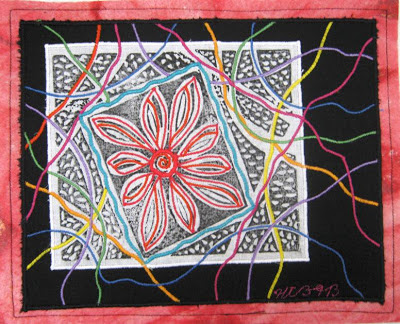
Today is my last day teaching in Baton Rouge. It's been great fun and I've got to work with some wonderful people. Which is much more positive than my feelings about this piece! I made this last Saturday before leaving on this trip.
I began with a hand stamped piece of fabric, placed it on a background of black which was then placed on red, dye painted batting. All of those choices were fine, but then I decided to add thick lines of satin stitch quilting and that is where it lost itself. The stitching in the flower makes it look messy rather than highlighting it and the waviness of some of the other lines add a feeling of chaos (the black and white polka dotty background isn't helping any either). I think that had I used a straight stitch in the flower then added the satin stitch in the other sections but kept them moving in gentle arcs rather than wiggling them about that the whole thing would have had a nice result. As it is, chaos ensues and though I like a good ride, I don't appreciate it in my art work.
Ah, realization and growth....
Till tomorrow,
Heather


4 comments:
This does have a lot going on, but personally, I don't mind some chaos in art.
Since learning with you, I see it as a challenge. A challenge to see if my novice thinking can pick out different elements of the piece; thinking about what I would do if asked to make some changes and why I would make those changes; and finding the appreciation in the work that the artist did.
I am sure you are correct in the suggestions you made for what you might do differently in a similar piece next time. You have a wonderful eye.
I however, am just learning to develop that eye. I am only just beginning to be able to see in my imagination what something would look like without the actual photo of it done.
I think the red frame around the black is very dynamic and I really like the stamped piece, dots and all.
The satin stitching in all of the colors is very vibrant and adds great texture and depth to the piece. It sits in the foreground like a web that's been slightly torn to reveal the flower underneath.
The only thing that calls out to me as something I would do if asked, is to do the stitching in the focal point flower in black rather than red. Either that, or maybe cut out some of the flower out so that the black showed through.
I would choose to do that because while the stamped piece is black & white, the black isn't dark like the background, and either method would bring the dark black forward.
I feel that black can bring attention to something but does it in a quieter way than red does.
But I would have to play with it to see, because I am not sure that the black outline would stand up strongly enough to the vibrant colored satin stitching. That I can't picture for myself. I kind of feel like doing this one in my sketchbook to see what would happen.
I actually love this piece! I understand what you say about it and I think I agree with the red in the flower. But I really like the "chaos" around the stamp. Because of how the colors work, the stamped part looks like it's floating in black space far away from the red frame and the satin stitched lines make it look like we're looking through something - web, curtain, something. That adds to the strong 3D-ness of the piece.
If it were my piece (and I thought up this great design in the first place), I would take out the blue satin stitching in the square around the flower and I might emphasize the flower with a lighter color.
I really love how the flower stamp recedes behind the red frame even though it is obvious it is on top of the black fabric, which is on top of the red batting. Love the effects of color!
Looking at it again, could the "chaos" satin stitching be crackling electricity??
Post a Comment