Art Every Day, Sunday, March 24, 2013
Good Morning,
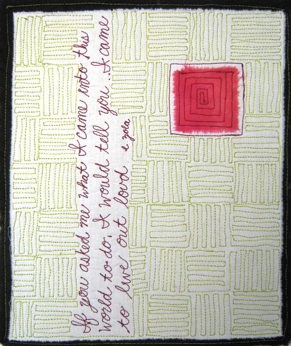
Here is today's new piece - and no, it is not on it's side. I designed it to have the writing on it's side. This is my favorite quote. It's on the top of my blog page and it's what I say to myself when I feel like I'm loosing my way or have lost my focus. This time we call life can be very difficult and it is easy to loose our focus. This quote helps me reconnect with my focus when I'm feeling lost.
Anyway, it's rather simple, but it packs a wallop. Red violet and yellow green stitching - I just love that complementary pair, all on a white ground that sits on a black ground. The writing was meant to be the focal point - being sideways helps with that - and the square is the counterpoint. The stitching in the background was meant to compete just a bit with the focal/counter points but not so much as to overwhelm them. To quote my friend John again, " my eyes enjoy looking at it" and my heart enjoys reading it.
I'm off to play with color at the studio,
Till tomorrow,
Heather

2 comments:
It's fascinating to think of this as a white background because the yellow green stitching makes the white look like yellow green!
This is one of those pieces that really grabs me in both its big and small photo versions.
Up close it's got that great quote in it and the yellow green stitching is neatly wrapped around the writing. I love to see that, I think it looks beautiful-thoughtful and intentioned.
The background is has strong lines but isn't overpowering. It provides a nice support for the bold red violet.
I am not sure why, but I like that you closed in the stitching on the red violet square rather than leaving it open-ended this time. It feels definitive and sure of itself or something.
Looking at it as a thumbnail, the stitching really stands out as the companion color to the square and the linear yellow green lines give the piece such a soft, overall glow of color to complement the red violet.
Something soothing to look at, but it has a strong message, both with the words and the work.
Love how with just 3 simple elements (the quote, the red-violet square and the yellow-green quilting) you made such a bold, well-balanced, interesting piece. Looking at it I sense calm and strength at the same time.
Simplicity all the way!
Post a Comment